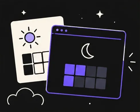
Open almost any app at midnight and it feels like someone switched on the lights. That’s because most apps are designed in bright offices during the day, and dark mode is added at the end.
We do it the other way around. Every Gika Games screen starts dark.
Players are tired, not in an office
Our games are made for quiet moments: the commute home, a coffee break, the last minutes before sleep. At those times your eyes are tired and the room is often dark. A bright white screen is the last thing you need.
Our color rules
- No pure white. Our lightest color is a soft, warm off-white. Pure white on a black background is harsh and makes text look like it’s vibrating.
- No pure black either. Our dark backgrounds are a deep charcoal. It’s softer on the eyes and keeps shadows and details visible.
- One accent color. A calm purple guides your eyes to what matters, like the next move or the play button.
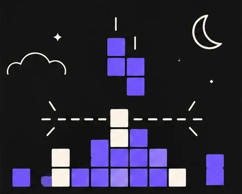
- Glow instead of flash. When something happens, like clearing a line, it glows softly instead of flashing.
Designing for the moment, not the feature
Dark mode first isn’t only about colors. It changes how we think about the whole game: fewer pop-ups, quieter sounds, slower animations, and nothing that suddenly lights up the room.
It’s also why this website is mostly dark. If you’re reading this late at night, we hope it feels a little kinder on your eyes.